BIRKENSTOCK — MINOR CAMPAIGN REBRAND
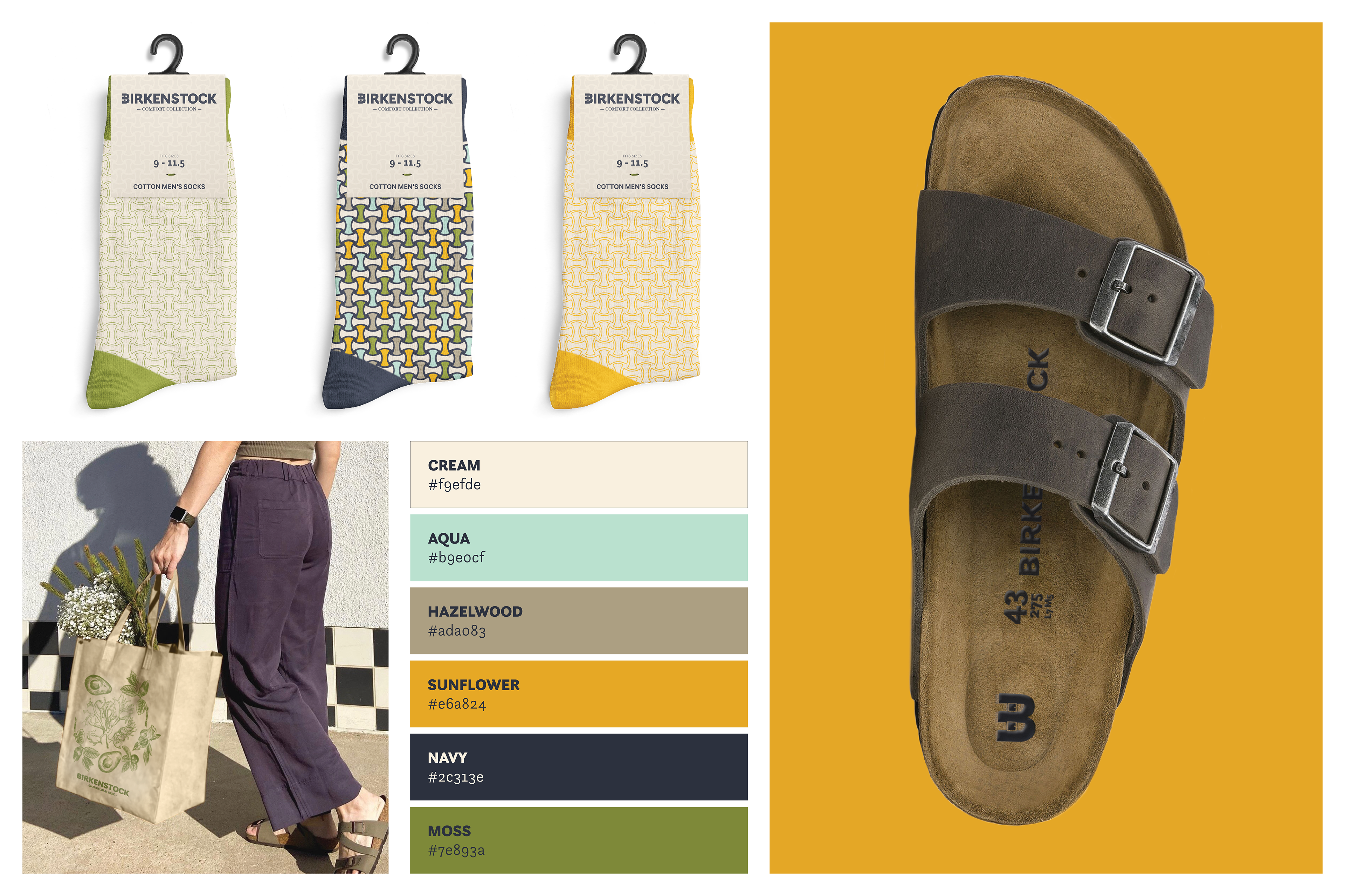
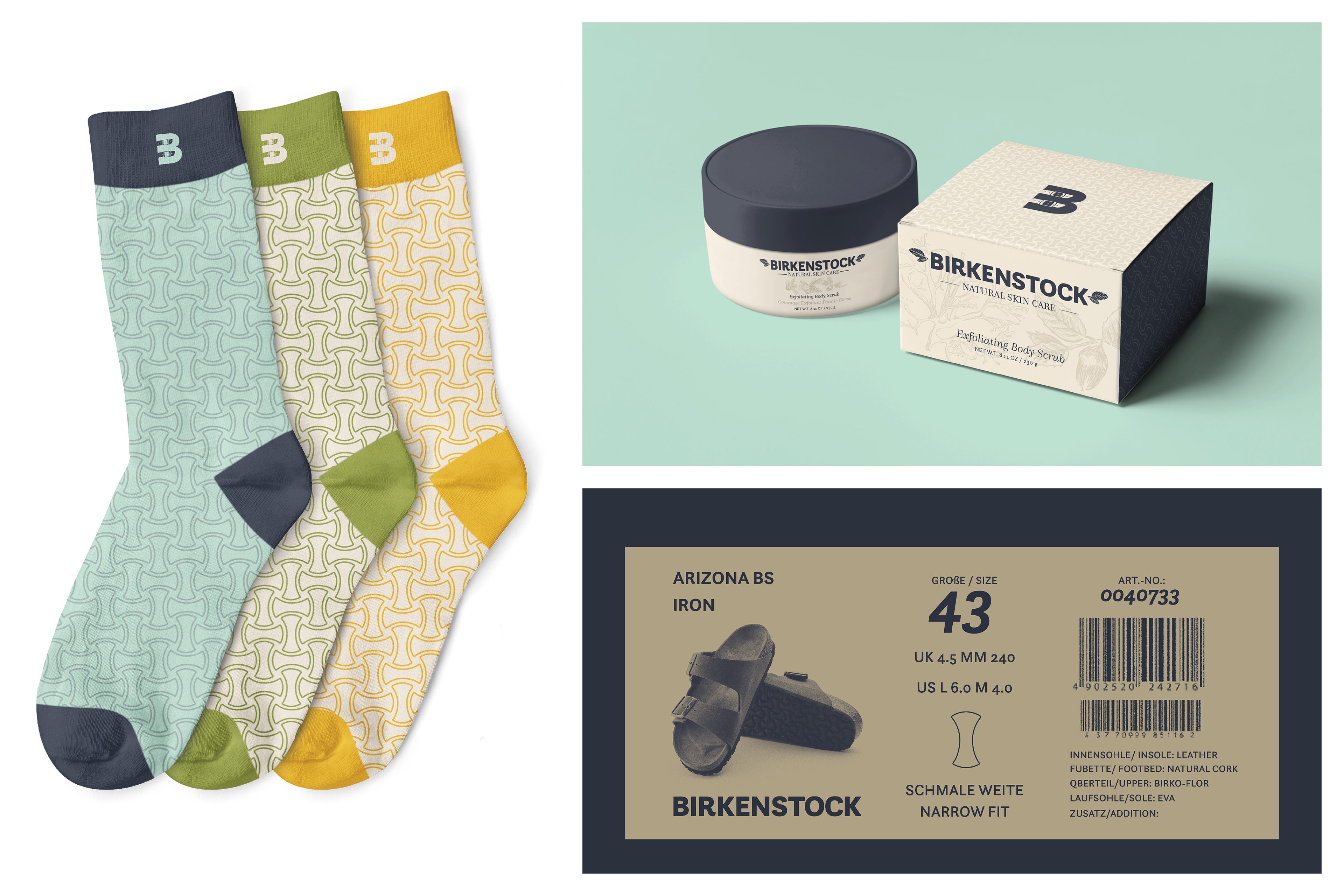
2019 was a big year for Birkenstock, they launched their Natural skincare line; this line was an exploration outside of their current consumer market. Prior to their launch, they have been known for their footwear among other accessories. With the launch, there were two different camps living under the Birkenstock name, each had a their own logo and set of colors. This campaign was created to assist in bridging that gap; the success of the campaign can be measured by the creation of a solid brand identity involving both camps.
Sole representing Birkenstock Shoes — The Sole pattern is referential of Birkenstock’s iconic pattern that is used on all of their soles of their famous footwear, and felt it was an integral piece in unifying the two camps at Birkenstock.
Shield representing Birkenstock Natural Skincare — The Shield pattern deviates from the Sole to function as the Shield, considering Birkenstock’s Natural skincare products were designed to protect and nourish the skin for a healthy glow.
Combination Pattern — To assist in the campaign’s brand unity, both the Shield and Sole patterns may be combined to create a variety of patterns; the only restrictions are the color palette and the grid structure.
Professor Douglas May | Senior Portfolio | Silver Award — Graphis Competition New Talent Annual